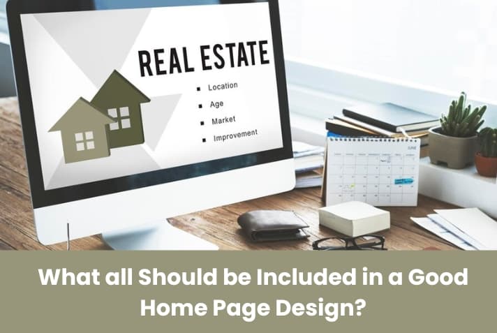
What all Should be Included in a Good Home Page Design?

They say - “nobody is perfect.” But certain things ought to be perfect. Just like your website home page or landing page. There are numerous options on search engines and your audience lacks time. Moreover the reduced attention spans have also become a reason for your website visitors to bounce off your website. So your website homepage should possess everything but at the same time in limits. The reason being your homepage should not look cluttered but should even not look incomplete. It should provide your website audiences with the information for which they landed on your website.
Benefits of a Good Homepage
Gives a Good First Impression
Your homepage is a vital tool for your organisation and is also the first impression of potential customers. There are many significant components of efficient web design, such as white space, font selection, colour schemes, and layout, but its content, not its design, is the essence of a website. Your homepage needs to introduce your product or service within a matter of seconds and entice visitors to further explore your site.
Helps you Generate Leads
It is a good idea to start with your home page if you are wondering how to generate more leads from your website. As the virtual front door of your business, this page is typically responsible for drawing in most of the traffic on your website. A lot of hats need to be worn on your homepage. It should be structured to represent different audiences, from different origins, rather than treating it as a dedicated landing page centred around one specific action. And it must be constructed with intent in order to do so efficiently. In other words, components that draw traffic, inform tourists, and invite conversions would need to be integrated.
Providing Easy Navigation
If users struggle to find key features on your home page, as a poorly crafted one, they will be quick to sign off your page. A basic design of the homepage invites your audience to your site, tells them what you want them to do next, and encourages them to more deeply explore your site.
Provides Information About your Business
Your homepage should provide a sense of the principles, unique selling proposition (USP), and intent of your business. If you can convey this information clearly and efficiently, you are more likely to draw in potential customers. The theme and approach that the rest of your site will adopt is also expressed on your homepage.
Enhances User Experience
The user experience on the main landing page of your site can build or break their view of your business.
Consumers are visiting your site for a reason. It could be testing your product line, reading your blog posts, or figuring out whether you are offering a specific form of service. However, you would like to guide the customer to the appropriate tab. By offering intuitive navigation and a sense of how your website flows, your homepage design should encourage this change.
They'll also be more likely to recall it in the future if guests enjoy their experience on your website. You may not be making a sale today, but the customer will return and buy from you days or weeks later.
Convert your Audiences
You want to convert website users, but they won't if you don't give them the opportunity and chance they need. You may want to create an email list, but your database will remain empty if visitors can't find a signup form.
You can see an increase in conversions by making this data readily available on your homepage.
Things to Consider while Designing your Home Page
Fast Loading Speed
Before discussing about the features or elements your home page should have, the priority lies in the fact that your home page should load fast. Whether you infuse your homepage with all the necessary aspects or characteristics but if it takes long time to load, all your efforts will go in vain. It should be well tested that it loads speedily including the images on your page. Make sure to optimize the images so that you do not give your audiences any reason to jump off your site.
Impressive Color Scheme
Once your page loads, the next important thing in line is to ensure that you use a nice color theme and blend the colors wisely. Colors not just make your site look attractive but it will make for a more enjoyable experience and impact the thoughts of people about your brand. We typically suggest that you select a few colours that fit together well and use them on your website. You'll want to make sure to use colours that pop for certain components, such as CTAs and menus, so they stand out even more.
Legible and Engaging Typography
The responsibility of providing pleasure does not only depend on your website images but your sit typography also plays an important role in engaging your audiences for a longer time by providing them a nice reading experience. Make sure that whichever font style you use it should be clear, easy to understand and just the right size. Your font style should not put any strain on the eyes of the readers in context of size or color used. The font color should be dark and also the background color should not affect the clarity of your words. Try to keep it simple and you can be creative with your logo, images and other branding elements.
The Website should be Responsive
Your efforts to design the best home page will be of no importance if your website is not responsive. Make sure to ask your web design company India to provide you with a mobile friendly website. It should be also checked that the CTA’s are working, that is they are leading the audiences where it is intended to.
The above points need to be taken into consideration while optimizing your home page.
Features your Homepage should have
A Well Defined Logo- The Power of Branding
On top of your website, your logo should be visible. It is, after all, the cornerstone of the branding and reputation of your company. The logo is a visible representation that contains your goods or services and is a vital piece for your brand to be recognised and connected by customers. Bear in mind, though, it needs to be easy to find anywhere you put your logo, and big enough that tourists can figure out what it means. These fast identifiers will easily let your users know that they have found the right page and can move on to discover your products and services and explore them. Don't let it take too long for your users to try to find out who you are!
Headline and Sub Heading
Your website needs to explain to visitors what you have to sell within a matter of seconds. A sub-headline or paragraph text headline should include a clear and concise overview of your organization and what you are doing or the services you provide. Usually, this is 2-3 sentences of strong, memorable, and succinct text that targets the needs of your audience. Avoid jargon.
Calls to Action
Coming to the objective of your website, that is to convert and this is where call to action buttons come in. Make sure that it needs to stand out from the rest of the elements within your homepage. You can use contrasting colors and good color combinations. Also choice of words play a very important role. All in all the goal is to convince the visitor to click on the button.
The purpose of the homepage of your website is to pique the attention of visitors and prompt them to dig deeper into your website's pages. One way to draw people into the interior pages, start the sale cycle, or at least initiate direct communication is through a call to action (CTA). CTA areas or buttons can be connected to contact forms, login forms, or other pages on your website. This is also a best way to increase the time your visitors spend on your site.
Good Quality or Hero Images
Along with attracting and holding the attention of your visitors images provide credibility to your website and that is the biggest advantage. Indeed big sized images are more effective, but you should also ensure that instead of placing a stationed image of your product and service you can put up a picture of somebody using your products and services. Images help audiences to connect with your website and its offerings. But do not forget to optimize them.
Readable and Easy to Use Navigation Menus
We have already spoken about the ease of navigation your homepage allows. A search box could be a valuable asset to include here, if your website is content-heavy. With things that make sense to new guests, the navigation menu should be easy to find. The navigation area is like a road map—it is important to provide visitors with an overview of the material and to help them find the data they are searching for using the most successful route. This is the most important element of your homepage as it can also house a CTA and is very beneficial in reducing the bounce rates.
Social Proof and Social Media
Ideally, your homepage should inspire trust in your visitors and establish your expertise. One of the best ways to achieve this is reviews and testimonials. Success stories also inspire a positive first impression. You can also link these quotes to case studies. Don’t forget to put name and photo.
There's a very good explanation why most websites have links on their home page to their social media. Keep your audience updated via Instagram or Twitter about your latest updates and promotions. You never know who could see your digital advertising when they need to at just the right moment. The new trend is to directly connect sites to Instagram stories, where swiping up will bring a user to see the items that are being pitched in the Instagram story itself directly to your website.
Now Some Content
Though this point is being discussed late but is of immense importance. Content is indeed the king, the most important element of your site both in terms of SEO and also to make your audiences understand about your offerings along with some images. It should be simple so that your audience understands your points. Your objective is to make them understand your point and not to impress them by your writing skills. To retain interest, it is important to communicate with the visitor, use a brand-consistent voice, and reassure them about how they can benefit from you. If it is a one page website a little bit of information about your team and products is necessary as you do not have an about us section.
After a nice piece of content describing about your business, some success indicators can also be attached beneath. This can be some awards or accolades you have received as a company. This makes your website impressive and earns great conversion points.
Contact us Information and the Footer
The footer also holds importance just as the header of your website. Whether or not you have a contact us page, contact details should be mentioned in the footer along with links to different pages of your website. Also precisely mention about your offerings and how you are different and unique from others. The footer also includes social media integration. Basically your footer acts as a small medium of connection and communication
All in all your homepage should be a complete package, defining your objectives in a clear manner, but at the same time not irritating your website audience. While you are not sure whether your site visitors will move on to other pages of the website, homepage acts as a representative of the pages within the website and can also prompt them to explore your website further. At indianwebsitecompany.com, we specialize in website design and development services.
We have all the tools you need at our fingertips, with a complete team of designers, developers, copywriters, and digital marketing experts! If you want to redesign your brand logo entirely, build an updated content plan, or bring to life a personalized tool that will provide your audience with value, As the best Indian web design company we will provide and introduce innovative ideas that will certainly impress your visitors providing them with an unforgettable browsing experience. We are the best web design company in India providing the most affordable website design packages and providing you with something beyond a website, a conversion machine.
We dont just aim visitors to your site but visitors converted to customers. This will be possible if your website is atractive, impressive and unique. The more traffic increased chances of leads and a better rank on search engines. The higher the rank the more brand recognition. The more the recognition the more chances to be clicked and shopped from.
Recent Blogs

What are Different Kind of Dynamic Websites?

Hire One Stop Shop Web Design Company for Complete Website Solutions
